

November 12, 2025
.webp)
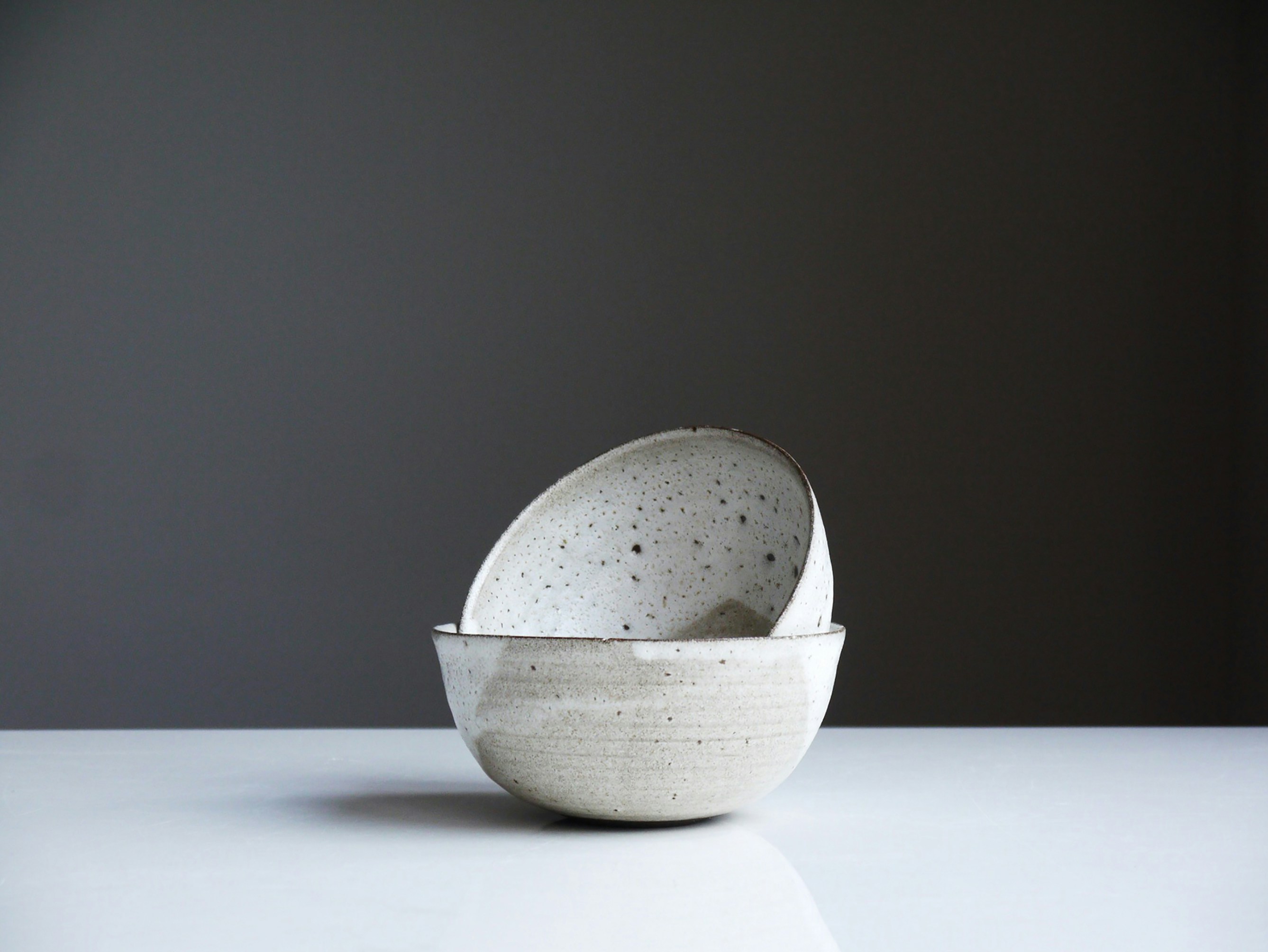
Minimal Isn’t Universal
When you type “Marie Kondo YouTube channel,” you’ll end up with two very different aesthetic worlds.
Her international channel is soft, clean, sparse... for short, the minimalism we expect. But switch to her Japanese-channel thumbnails, and you’ll find bright colors, bold text overlays and crowded layouts. It looks louder, busier, more kinetic.
What’s going on here isn’t inconsistency so much as strategy. It’s a visual language shift driven by cultural expectations.

What the Difference Looks Like
- On her international channel, KonMari leans into the Zen/clean-space aesthetic: muted tones, minimal text, calm visuals.
- On her Japanese channel, thumbnails use vibrant colors, lots of Japanese copy overlay, energetic designs.
- Viewers on the Japanese channel see more personality in posing, more expression, more text cues (titles, highlights) on the image.
We can note that while her content stays thematically consistent, the presentation changes by audience.
Why These Differences Matter
1. Cultural Visual Expectations
Japanese media (TV, ads, YouTube) commonly uses bright text overlays, “busy” layouts, visual noise to signal energy, emphasis, and clarity. It’s part of how information is communicated when “reading the image.”
By contrast, for many foreign / Western (or global English-speaking) audiences, minimalist layouts feel elegant, calm, credible.
So what works for one isn’t universally “better” : it’s about what feels right in each cultural context.
2. Attention & Clarity in Culture
- In Japan, viewers may expect immediate cues: what is the video about? What’s its “hook”? Text overlay directly on thumbnails helps communicate purpose quickly.
- Abroad, minimalism suggests sophistication, trust, or lifestyle alignment. It signals calm authority rather than urgency or emphasis.
3. Brand Persona & Positioning
Marie Kondo is simultaneously a lifestyle guru, media personality, and familiar local figure in Japan. Domestically, audiences know her already; you need to “push” visually more to break through the clutter of media. Internationally, minimalism helps frame her as a refined authority, maybe even exotic in her restraint.
Lessons for Designers & Creators
How can you use this idea in your own editing /design/content production?
- Split Your Visual Voice by Audience
If you create content for both your home market and for global or foreign audiences, consider two “editing templates” or “thumbnail standards” — one louder and energetic, one calmer and refined. - Study Local Platform Design Conventions
Look at comparable channels or competitors in your target market. See how they overlay text, use color, facial expressions, motion blur, etc. Mirror what users expect there. - Balance Identity + Expectations
Don’t simply copy “busy Japanese style” if that isn’t you... but translate your identity through that visual vocabulary. Maybe use bright accent colors, more text labels, or expressive visuals with your own design aesthetic. - Test & Measure Engagement Separately
Use A/B testing: Thumbnails with more text overlays vs minimal ones; more color vs muted tones; for your Japanese-audience version vs your global-audience version. See which gets click-through, watch time, subscriptions. - Be Intentional With Visual Signals
Things like font size, color saturation, contrast, and how much “space” vs “dense information” are present — all of these carry emotional / cognitive weight. What feels “clear” to you might feel “empty” to someone else — depending on cultural context.
Why It’s More Than "KonMari"
This isn’t just a trick for one YouTuber. It’s a window into how culture informs visual storytelling.
- Japanese advertising often leans into kawaii, bright text overlays, multiple seals/labels on product packaging, high context visual signals.
- Global design often prizes subtlety, restraint, whitespace, less explicit labeling.
Understanding both gives you the “visual fluency” to design for multiple audiences without diluting your identity.
Closing Thought
If you want to “sell Japan” to foreigners, minimalism is your friend. It evokes calm, design-driven vision, and taps into what they expect Japan to look like.
But if you want to “sell Japan” to Japanese people? Sometimes you need to speak their visual language: vibrant, text-rich, expressive.
Create your visuals not just for what you want to show, but for who is seeing it.
—
Lisa Anglade,
Co-founder at Pont Miyabi🌏
🔗 Connect: LinkedIn | Website
📩contact@pontmiyabi.com
Other blogs
What's happening
Our latest news and trending topics