
November 10, 2025
Scrolling through social feeds, most content disappears in a blink. Yet some posts stop thumbs mid-scroll. What’s their secret?
Often, it’s not originality. It’s familiarity.
And Quatr is the perfect example.
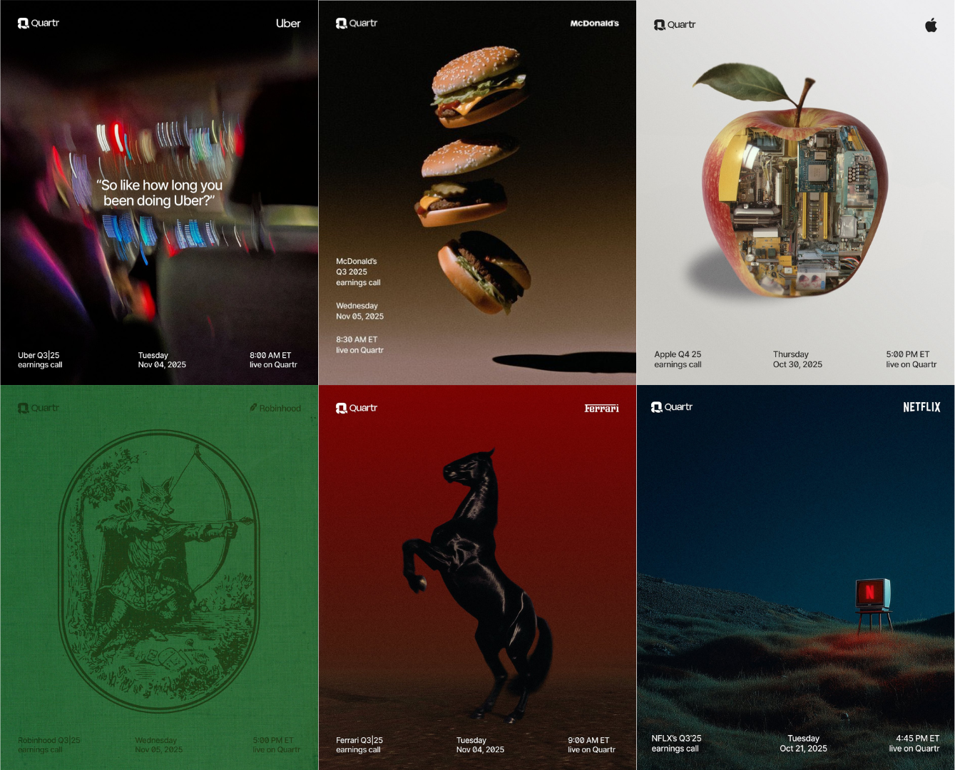
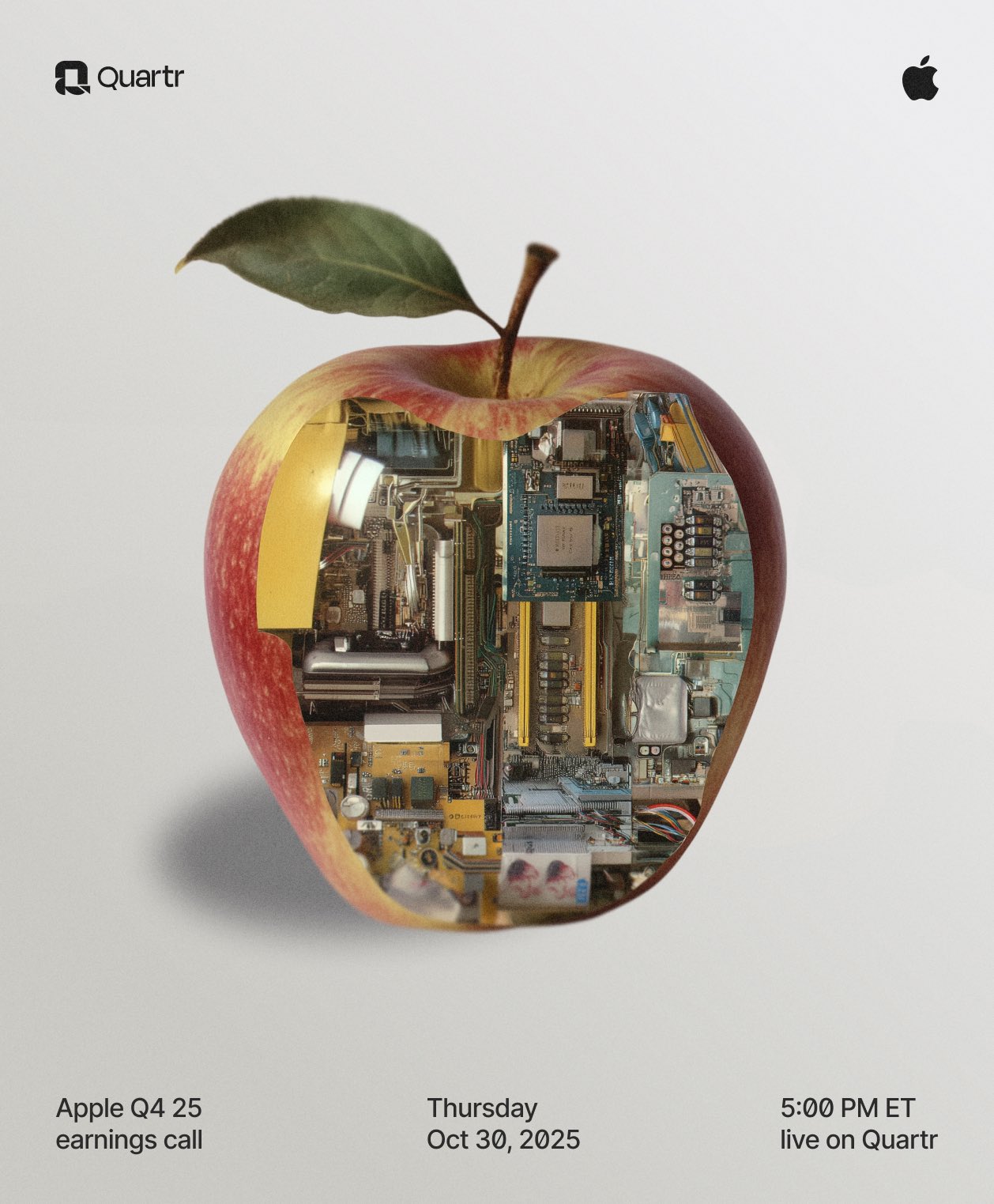
Quatr isn’t a marketing agency, nor a visual design studio. Yet they went viral and sold their call services through a brilliant marketing strategy : AI-generated, cinematic “aesthetic” posters featuring brands we all know, like Spotify, Ferrari, McDonald’s...
The visuals weren’t just cinematic : they were instantly recognizable. Audiences didn’t need to read the caption to feel something.
The familiarity of the brands did the heavy lifting, while the design amplified the emotion.
Why Familiar Visuals Work
- Instant Recognition Reduces Cognitive Load
Your brain processes known imagery faster. Familiar logos, colors, or movie references signal meaning immediately. Social media studies show that posts featuring familiar elements receive up to 30% higher engagement than posts without recognizable cues (Hootsuite, 2023). - Emotion Already Exists
Popular brands and movies carry their own emotional weight. Seeing a Ferrari, McDonald’s, or a recognizable scene from The Matrix immediately triggers associations: excitement, nostalgia, aspiration. Your edit doesn’t need to create emotion : it builds on one that already exists. - Shareability Increases
Content featuring familiar references is more likely to be shared. People want to show “I get it,” which drives virality. Quatr’s aesthetic posters spread widely because they tapped into shared cultural touchpoints, not obscure references.
Other Brands That Leverage Familiarity
- Netflix trailers often remix iconic imagery or familiar actors to grab attention in the first 3 seconds.
- Coca-Cola’s holiday campaigns repeatedly reuse the red-and-white Santa motif—instantly recognizable, globally.
- Adobe and Canva templates use subtle nods to film or gaming aesthetics, giving users a visual shortcut that feels “cool” without starting from scratch.
-
All these examples follow the same principle: leverage what people already know, then amplify it with design, motion, or storytelling.

How to Use Familiarity in Your Own Editing or Design
- Pick a Recognizable Element
- A brand logo, a movie scene, a product, or even a popular meme.
- Add Your Unique Twist
- Change the color scheme, add cinematic AI effects, or animate it in a way that feels fresh.
- Use Emotion as Glue
- Don’t just replicate—highlight the emotional essence. Ferrari = aspiration; McDonald’s = nostalgia; Spotify = discovery.
- Test Cultural Resonance
- Some references resonate globally, others only locally. Adjust to your audience.
Example Ideas:
- Animate iconic brand logos into a cinematic, looping reel for TikTok or Instagram.
- Reimagine a famous movie scene with your own color grading or motion style.
- Use recognizable packaging or products in “AI-generated poster” formats like Quatr, but add your own story or visual punch.
Closing Thought
As a creator originality is crucial, of course. But in the attention economy, familiarity is your secret weapon. Quatr shows us that combining known symbols with skillful design, motion, and emotional storytelling can stop thumbs, spark shares, and make your work memorable.
In social media, design isn’t just about what you create : it’s about what the audience already knows and feels. Familiar visuals bridge that gap instantly.
—
Lisa Anglade,
Co-founder at Pont Miyabi🌏
🔗 Connect: LinkedIn | Website
📩contact@pontmiyabi.com
Other blogs
What's happening
Our latest news and trending topics
.png)