
November 14, 2025
One of the quietest ads in the world might be a Muji commercial.
No voiceover.
No sale banner.
Just a breeze through linen curtains, the sound of tea being poured, a woman folding clothes.
And somehow, it works...?
That’s because Muji doesn’t sell products.
It sells peace of mind.
But what’s even more interesting is that this calm isn’t universal.
It looks one way abroad, and another way at home.
Let’s unpack why.
Different Languages of Calm
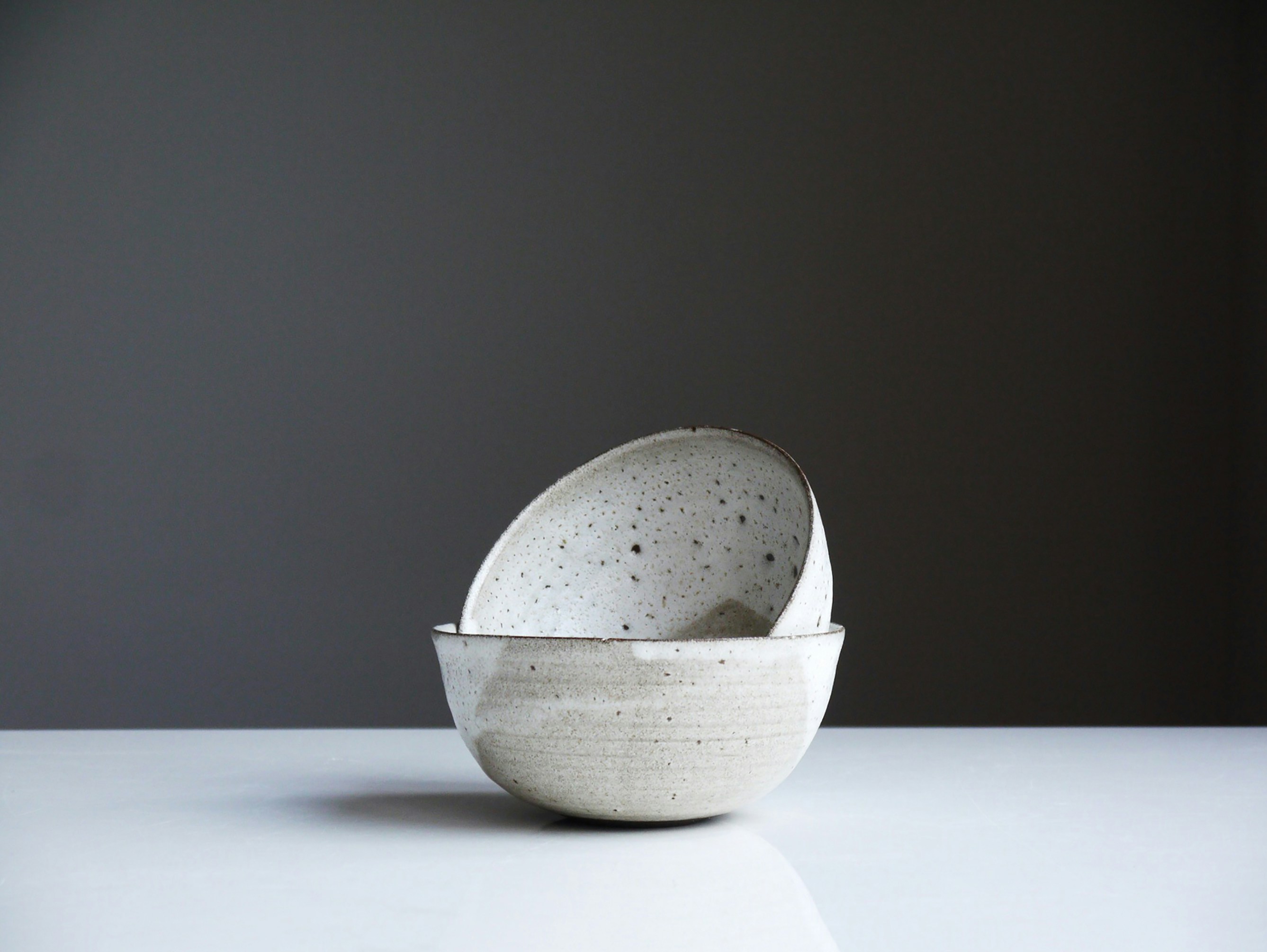
Globally, Muji has become a visual synonym for Japanese minimalism.
Neutral colors, wide white margins, a rhythm that feels almost meditative.
In the West, this “anti-brand” aesthetic became luxury.
You’re not buying a mug; you’re buying a feeling, one of quiet confidence, intentional living, the fantasy of control in a noisy world.
But switch your perspective to Japan, and suddenly “calm” looks different.
Here, minimalism isn’t an aspiration. It’s everyday life.
Really, you don’t need Muji to remind you to breathe.
That’s why other lifestyle brands like Kurashi & Trips (a cozy, slow-living brand founded by illustrator Kazumi Tsubota) or Nitori, Japan’s friendly home store, take a warmer path.
Their visuals are still peaceful, but they’re alive.
Soft daylight, handwritten labels, a table with slightly uneven dishes. There’s chatter, family, and imperfection.
Where Muji sells silence, Kurashi & Trips sells comfort.
Where Muji shows space, Nitori shows use.

The Cross-Cultural Calm Gap
This difference runs deeper than style. In fact, it’s cultural rhythm.
In Western marketing, “silence” often signals luxury.
Think Apple’s white backgrounds, or Aesop’s slow, wordless films.
It says: we don’t need to explain ourselves.
In Japan, silence doesn’t mean status, but subtlety.
It’s the pause (間, ma) that gives room for emotion to surface.
Japanese audiences read emotion through microdetails. Texture, pacing, even background sound.
A single quiet second can mean care.
So when global designers borrow Japan’s minimalist calm, they often miss that emotional density.
Stillness Isn’t Emptiness : It’s Trust
As we editors know, when we strip away noise in design or editing, we’re not removing information. We’re creating space for meaning to land. And not only that: that breath builds empathy.
And in digital content, this principle still holds.
Whether it’s a short film, a brand reel, or a product post, viewers notice when something feels unhurried.
It signals confidence, and it earns trust.
Designing Silence
For editors and designers, the takeaway isn’t “be minimal.”
It’s “be intentional.”
- Use visual rhythm the way musicians use rests.
- Let white space and slow motion carry emotion instead of words.
- Add texture — a breeze, a scratch, a small imperfection — to make calm feel human, not sterile.
- And remember: in Japan, silence is not absence. It’s a form of care.
Because in a world shouting for attention, sometimes the quietest voice is the most persuasive one.
—
Lisa Anglade,
Co-founder at Pont Miyabi🌏
🔗 Connect: LinkedIn | Website
📩contact@pontmiyabi.com
Other blogs
What's happening
Our latest news and trending topics
.png)
.webp)